A couple of weeks ago I started to actually learn the programming language R after a number of early little experiments, drawn to it by its power in data analysis, in visualisation (especially!) and its cost (nothing). I’ve always been crap with programming languages, I haven’t the patience to learn them and I never know what to do with them (I’m not counting markup languages like CSS and LaTeX).
But with one obvious reason to use R (for data analysis at work) and with such resources as Google (and StackOverflow) it’s been pretty easy to pick up the language so far – I’m an instant fan. I was pleasantly surprised to find that copying data in from Excel via the clipboard was so easy. On Windows, it’s:
data <- read.delim("clipboard")On Mac it’s less intuitive but still similarly easy:
data <- read.delim(pipe("pbpaste"))As an example, here’s the first few lines of output from a battery cycling instrument (a two-year old data file, and nothing particularly interesting!). With the above command(s) R automatically creates a table (data frame) with the same column titles (except for automatic exchange of the parentheses ‘(‘ or ‘)’ for dots ‘.’) to avoid errors in evaluating the code.
Data_Point Test_Time(s)    Date_Time   Step_Time(s)    Step_Index  Cycle_Index Current(A)  Voltage(V)  Charge_Capacity(Ah) Discharge_Capacity(Ah)  Charge_Energy(Wh)   Discharge_Energy(Wh)    dV/dt(V/s)
1   1.031384415 10/02/2013 09:30:54 1.031385056 1   1   0   3.163092613 0   0   0   0   0
2   2.061326196 10/02/2013 09:30:55 2.061326517 1   1   0   3.162784815 0   0   0   0   -6.15597E-05
3   3.090463734 10/02/2013 09:30:56 3.090464055 1   1   0   3.162476778 0   0   0   0   -0.000123167
The real file in fact contains all data points for a lithium-sulfur battery being tested by continuously discharging and recharging. In this case I have fifty charge/recharge cycles which is almost 8,000 rows of data.
One thing I would normally do with this data is for example plot a voltage profile (voltage against capacity). It’s a technical point, but generally I prefer the type of plot where the recharge is traced from the end of the discharge. So I just have to quickly make a new column in data which I’ll call Q, with the units converted from Ah to mAh…
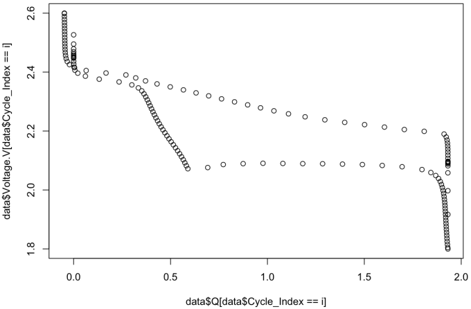
data$Q <- (data$Discharge_Capacity.Ah. - data$Charge_Capacity.Ah.) * 1000The simplest plots can be made with the function plot(x,y). In this case I would like to plot my capacity column Q on the x-axis with voltage on the y-axis. I would only like to plot one cycle, and thankfully it is easy to tell R to plot values these values while the Cycle_Index column has a specified value. So for example, I can plot the 5th cycle with this line:
plot(data$Q[data$Cycle_Index == 5], data$Voltage.V[data$Cycle_Index == 5])The result:

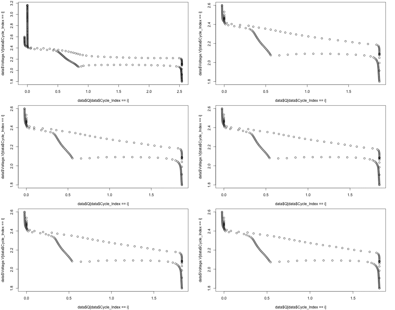
Or, with the animation library installed, with a simple loop one can make an animated .gif to watch the changes in the voltage profiles over the first 50 cycles:
saveGIF(
  for(i in 1:50){
    plot(data$Q[data$Cycle_Index == i], data$Voltage.V[data$Cycle_Index == i])
  }, interval = 0.1, ani.width = 640, ani.height = 400)
A bit unpolished, but neat anyway. This is easily expanded to more fancy graphs with proper scaling and labelling, but that’s for another day and another post…