A half-solution for two (or more) y-axes with ggplot
I’ve been teaching R, and especially ggplot, to beginners in the language this week, and predictably the topic of how to put two separate y-axes (with a common x-axis) on the same plot came up.
Unfortunately, the answer is “not easily”, since the inability to do this is on purpose (Hadley Wickham gives the reasons here, for example). Actually putting one y-axis on the left side of the graph and a different y-axis can be done, but requires some delving into the heart of ggplot which is a beyond my understanding at the moment.
What is easier - and in my opinion, preferable in most cases - is to use facetting or a package like gridExtra to have separate stacked panels. But gridExtra (specifically the grid.arrange() function) misaligns plots which have expressions (subscripts and superscripts) in the axis titles - and facetting by default doesn’t make it easy to label axes the way I want (again, because I often need to add super/subscripts in labels), or rescale the y-axes of individual facets to values I want.
I had a think about it after the discussion we had in class, and managed to reach a reasonable compromise with the facetting approach, which is fairly straightforward and doesn’t require any extra packages.
I’ll demonstrate this with some arbitrary functions with very different ranges of y values:
x <- seq(from = -5, to = 5, by = 0.05)

df <- data.frame(
  x = x,
  fun_a = sin(x^2),
  fun_b = 50 * sin(x)
)
To make use of facet_grid() this data needs to be converted to “long” format, which is easily accomplished with tidyr::gather():
library(tidyverse)

df2 <- df %>%
  gather(key = fun, value = y, -x)
Now we can ggplot() this data with the two functions in separate facets, making use of the scales = "free_y" argument:
ggplot(df2) +
  geom_path(aes(x = x, y = y, color = fun)) +
  facet_grid(fun ~ ., scales = "free_y")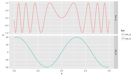
free_y option
This is fine, but what if I want to plot data series which have different units? I’d prefer to have an axis title on the left for each facet. There’s only one y-axis title here, and I can’t easily change that - but what I can do instead is change the facet labels, move them and make them look like axis titles.
The easiest thing to do seems to be to change the column names with dplyr::rename() before gather(). To show the superscripts, etc, the column names have to have the form of expressions, like they would if you were to do the same thing with ylab().
df3 <- df %>%
  rename(`sin~(x^2)` = fun_a, `'50'~sin~(x)` = fun_b) %>%
  gather(key = fun, value = y, -x)
Now I can remake the plot with a couple of extra arguments to facet_grid(), and some theme() modifications to make the strip.text (facet label) look the same as the x-axis label.
ggplot(df3, aes(x = x, y = y, color = fun)) +
  geom_path() +
  facet_grid(fun ~ ., scales = "free_y",
             labeller = label_parsed,
             switch = "y") +
  theme(strip.background = element_blank(),
        axis.title.y = element_blank(),
        strip.text = element_text(size = rel(1))) +
  guides(color = FALSE)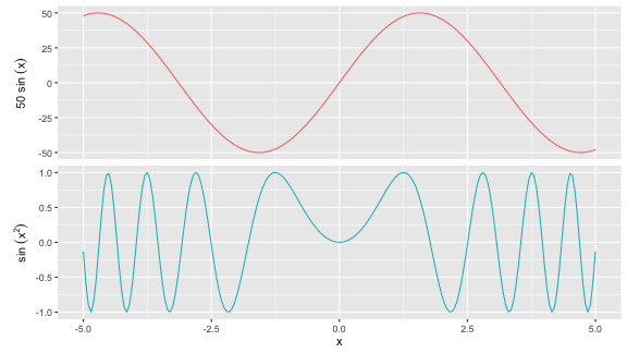
Great! This is more or less what I’m after. I still have some grumbles though. One of the main ones is that I can’t easily rescale the y-axis on an individual facet - I’m stuck with scales = "free_y".
The most I can do - as far as I know - is force it to rescale a bit outside the range of the data by making some dummy data which I include in the plot as an invisible geom_blank. Like this:
dummy <- data.frame(
  x = 0,
  y = c(-1.5, 2),
  fun = "sin~(x^2)"
)

ggplot(df3, aes(x = x, y = y, color = fun)) +
  geom_path() +
  geom_blank(data = dummy) +
  facet_grid(fun ~ ., scales = "free_y",
             labeller = label_parsed,
             switch = "y") +
  theme(strip.background = element_blank(),
        axis.title.y = element_blank(),
        strip.text = element_text(size = rel(1))) +
  guides(color = FALSE)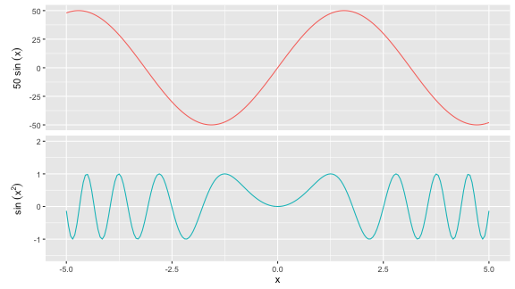
But I don’t know if rescaling the y-axis of a single facet to a range within that of the data is easily achievable. I would also like to be able to change the facet heights manually - maybe that’s possible with gtable, for example, but that’s out of my expertise. Here’s hoping for an easier implementation in a future version of ggplot!