On This Page
arbintools - an R package for importing and plotting data for Arbin users
On This Page
Introduction
Those familiar with my day-to-day work over the last year will know I’ve been using the R programming language to do nearly all the analysis for my battery testing data. Most of this is done with the Arbin instruments we have at work, which I have come to like for the flexibility in the way testing programs can be constructed as well as the consistency of the data output (even though I would prefer not to get the data in Excel spreadsheet form).
Partly for my own purposes but also for the benefit of any other users of Arbin instruments, I’ve started to refine some of the functions I find most useful to increase the throughput of routine data analysis. The idea being that one could get out a publication-quality, typical plot – such as voltage profiles or capacity vs cycle number plots – from the raw data in as little as a couple of lines of code.
I’ve made these functions available as an R package via GitHub, so that any potential users can obtain them easily and use them. This page serves to give information for installation and some examples of usage. I must however offer the following words of caution:
Nonetheless, I think most inflexibilities can be worked around at the moment, and I will continue to try to refine these functions to be able to guess what sort of data they handle as well as possible. I can only work with the data I create, however, so feedback is very welcome:
Installation
If you don’t currently have R, you will need to download and install it. I also thoroughly recommend installing the excellent RStudio for actually working with R.
Once you have R, you need the devtools package to be able to install packages from GitHub. Install it if you need it, and load it:
install.packages("devtools")
library(devtools)
You can then install my arbintools package similarly:
install_github("mjlacey/arbintools")
library(arbintools)
Note: The functions currently require the packages readxl, dplyr, ggplot2, scales and grid before you can use them – if they aren’t all installed, the functions won’t work properly. Though if I’ve set up the package correctly they should be installed automatically. You don’t need to load them with library() though; they will be called when needed.
As of January 6th, 2016, the package provides two functions for importing data: arbin_import() and arbin_import_raw(); and three functions for plotting data: arbin_quickplot(), arbin_plotvp(), and arbin_Qplot().
Importing data
Data exported from the instrument in the usual Excel spreadsheet format can be imported directly into R using one of the importing functions, which have several options. You can check the help file for information on usage and the function arguments in the usual way, by typing, for example:
?arbin_importYou will then see that the general usage of this function is of the form:
arbin_import(file, step.time = TRUE, energy = TRUE, cycles = 100,
  mass = NULL, meanE = FALSE)
Only the file argument is the required, the rest have defaults values. The plotting functions do however assume that you will enter an active material mass (in milligrams), so that the capacities are converted into mAh/g. Typically, you might import a data file like this:
mydataset <- arbin_import("/path/to/mydataset.xlsx", mass = 1.000)The arbin_import function imports the raw data from the Excel file (which may be spread over several sheets in the Excel file), creates a new table of statistics, and outputs a table (or data frame) of raw data (raw) and a table of statistics (stats) as a list. You can check this is the case with str():
str(mydataset)List of 2 $ raw :'data.frame': 100372 obs. of 10 variables: ..$ t : num [1:100372] 2 4.03 6.06 8.09 10.02 ... ..$ step.n: num [1:100372] 1 1 1 1 1 2 2 2 2 2 ... ..$ cyc.n : num [1:100372] 1 1 1 1 1 1 1 1 1 1 ... ..$ I : num [1:100372] 0 0 0 0 0 ... ..$ E : num [1:100372] 3.08 3.08 3.08 3.08 3.08 ... ..$ Q.c : num [1:100372] 0 0 0 0 0 0 0 0 0 0 ... ..$ Q.d : num [1:100372] 0 0 0 0 0 ... ..$ step.t: num [1:100372] 2 4.03 6.06 8.09 10.02 ... ..$ En.d : num [1:100372] 0 0 0 0 0 ... ..$ En.c : num [1:100372] 0 0 0 0 0 0 0 0 0 0 ... $ stats:'data.frame': 100 obs. of 5 variables: ..$ cyc.n: int [1:100] 1 2 3 4 5 6 7 8 9 10 ... ..$ Q.c : num [1:100] 1073 1046 1010 993 980 ... ..$ Q.d : num [1:100] 1064 1001 976 958 940 ... ..$ CE : num [1:100] 0.991 0.957 0.966 0.965 0.959 ... ..$ EE : num [1:100] 0.919 0.902 0.913 0.912 0.907 ...
Since this is a list, you can address the individual tables or columns in the usual way, e.g.:
head(mydataset$raw)t step.n cyc.n I E Q.c Q.d step.t En.d En.c 1 2.001685 1 1 0.0000000000 3.081635 0 0.000000e+00 2.001685e+00 0.000000e+00 0 2 4.028766 1 1 0.0000000000 3.081635 0 0.000000e+00 4.028766e+00 0.000000e+00 0 3 6.057592 1 1 0.0000000000 3.081328 0 0.000000e+00 6.057593e+00 0.000000e+00 0 4 8.085781 1 1 0.0000000000 3.081635 0 0.000000e+00 8.085781e+00 0.000000e+00 0 5 10.023822 1 1 0.0000000000 3.081635 0 0.000000e+00 1.002382e+01 0.000000e+00 0 6 10.024086 2 1 -0.0001899439 3.067197 0 7.384615e-08 1.811139e-06 2.253846e-07 0
The arbin_import_raw() function is very similar to arbin_import(), but does not calculate a separate table of statistics. Consequently if you use this function you get a data frame out, rather than a list of two data frames:
mydataset2 <- arbin_import_raw("/path/to/mydataset.xlsx", mass = 1.000)
str(mydataset2)
'data.frame':	100372 obs. of  10 variables:
 $ t     : num  2 4.03 6.06 8.09 10.02 ...
 $ step.n: num  1 1 1 1 1 2 2 2 2 2 ...
 $ cyc.n : num  1 1 1 1 1 1 1 1 1 1 ...
 $ I     : num  0 0 0 0 0 ...
 $ E     : num  3.08 3.08 3.08 3.08 3.08 ...
 $ Q.c   : num  0 0 0 0 0 0 0 0 0 0 ...
 $ Q.d   : num  0 0 0 0 0 ...
 $ step.t: num  2 4.03 6.06 8.09 10.02 ...
 $ E.d   : num  0 0 0 0 0 ...
 $ E.c   : num  0 0 0 0 0 0 0 0 0 0 ...
Plotting data
Currently, I’ve included three functions which return ggplot2 graphs. These are:
arbin_quickplot(): for quickly plotting any of the variables in either imported against each other. The function automatically replaces the default imported variables with correctly formatted axis labels, so plots used with this function can conceivably be used in publications without further modification.arbin_plotvp(): for plotting voltage profiles of selected cycles.arbin_Qplot: for plotting discharge capacity vs cycle number plots for multiple datasets.
arbin_quickplot()
This function takes the general form:
arbin_quickplot(data, x, y, geom = geom_point, size = 4)The main arguments are data, which must be a data frame, and x and y, which are any of the variables in data. A simple example might be a typical discharge capacity vs cycle number plot:
arbin_quickplot(mydataset$stats, x = cyc.n, y = Q.d)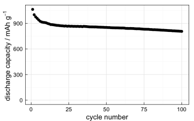
It is possible to build this simple function into more advanced plots before resorting to creating the ggplots from scratch. For example, since dplyr is loaded, you can subset the data with the functions from that package and plot, say, a voltage profile of a single cycle:
arbin_quickplot(filter(mydataset$raw, cyc.n == 10), x = t, y = E,
  geom = geom_path, size = 1)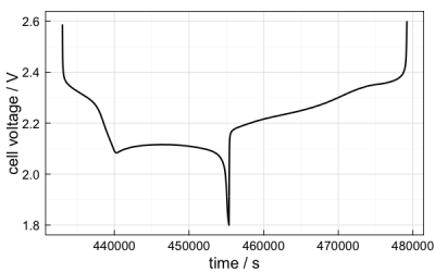
The geom and size arguments are included in the function so that you can change from points to lines, if desired, as well as the size of the point or line.
At this point, I will make an admission: coulombic efficiency is calculated in the import function as the ratio of the discharge capacity to the charge capacity, since this is the convention for lithium-sulfur batteries. Generally, it is the other way round for full cells and positive electrode half-cells. At the moment I have not included a check in the function to guess which way round it should be, so if the other version is required, a workaround is required. Luckily, I can offer a lithium-sulfur-based demonstration of such a workaround.
The reason coulombic efficiency (C.E.) is defined the way it is for Li-S batteries is because cells normally overcharge on each cycle because of the redox shuttle effect. Therefore, the lower the C.E., the more severe the overcharge. One could make the argument that you could define the overcharge as (1/C.E. – 100%), so that a C.E. of 97% on a given cycle corresponds to (1/0.97 – 1) = 3.1% overcharge. What has this got to do with the plotting function you ask? Well, suppose I plot coulombic efficiency like so:
arbin_quickplot(mydataset$stats, x = cyc.n, y = CE)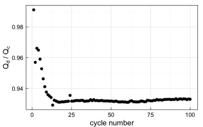
I can instead transform the coulombic efficiency data into “overcharge” in the function. However, since the function won’t be able to find the correct axis label to plot, I need to add that too. Thankfully, this is easy:
p <- arbin_quickplot(mydataset$stats, x = cyc.n, y = 100 * ((1/CE) - 1))
p <- p + ylab("overcharge / %")
p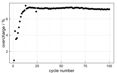
arbin_plotvp()
The arbin_plotvp() function is relatively simple. The general form is:
arbin_plotvp(data, cycles)data is a data frame of raw data, but it does not matter if you use the form mydataset$raw or just mydataset – if you have imported the data with arbin_import() and mydataset is a list, the function will recognise that and use the raw data anyway. cycles can be a single number or a vector, if you want to plot multiple cycles. For example:
arbin_plotvp(mydataset, cycles = c(5,10,20,50))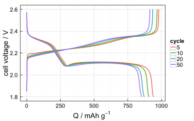
arbin_qplot()
This function is for plotting a discharge capacity vs cycle number plot for multiple datasets on the same plot. The general form is:
arbin_Qplot(list, labels)list is a list of datasets – where each dataset is the list imported by arbin_import() – and labels is a vector containing the legend entries for the plot. The labels are necessary – the function will throw an error if there aren’t the same number of labels as datasets. So, suppose you have two datasets that you import:
mydataset1 <- arbin_import("/path/to/mydataset1.xlsx", cycles = 50, mass = 1.4)
mydataset2 <- arbin_import("/path/to/mydataset2.xlsx", cycles = 50, mass = 1.3)
You can then plot discharge capacity vs cycle number for both of these as follows:
arbin_Qplot(list(mydataset1, mydataset2), labels=c("cell A", "cell B"))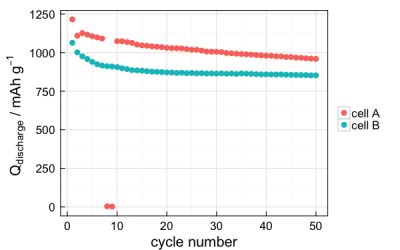
I’ve been using lists in this way for a while – it can make for an efficient workflow when dealing with 3, 4 or more different sets of data. For example, you can create a table with the locations of files and the active material masses, and even the labels if you want:
cells <- data.frame(
  cell = c("/path/to/mydataset1.xlsx", "/path/to/mydataset2.xlsx"),
  mass = c(1.4, 1.3),
  labels = c("cell A", "cell B"),
  stringsAsFactors = FALSE)
Whatever the number of cells in your table cells, you can import them all using lapply():
data.to.plot <- lapply(1:nrow(cells), function(i) {
  arbin_import(cells[i,1], mass = cells[i,2], cycles = 50)
})
I’ve written about the benefits of using lapply before, and anyone serious about using R for data analysis would do well to learn how to use it. Having done the above, the object data.to.plot has the list of data you want to give to the arbin_Qplot function, so passing the line:
arbin_Qplot(data.to.plot, labels = cells$labels)…gives the same capacity vs cycle number plot as previously shown.
If you’ve read through this far, thank you for bearing with me, and I hope you find some use or interest in this!
comments powered by Disqus